Quick Summary
To prepare ai images printing projects well, check that the file has enough pixels for your print size, usually 150 to 300 DPI. Upscale the source with one clean pass, convert to the print provider's ICC profile, and export a lossless PNG or TIFF. Then test a small proof before the full order.
- Multiply print width in inches by 150 to 300 DPI to find the pixel size you need.
- A 16 x 20 inch print at 150 DPI needs about 2,400 x 3,000 pixels.
- Run the upscaler once, since repeated passes often add halos or waxy skin.
- Ask your print provider for the exact ICC profile before converting to CMYK.
- Export PNG or TIFF, never high-compression JPEG, and print a small test strip first.
Table of Contents
How to Prepare AI Images for High-Quality Printing
Last Updated: November 4, 2026
Why AI Images Need Preparation Before Printing
AI-generated artwork often looks sharp on a screen but soft on paper. An AI image is usually built for a monitor, not a wall. Preparing AI images for high-quality printing means checking size, resolution, color, and file format before you click order.
Most AI generators output a square image of a fixed pixel size. That size works fine on a phone. Stretch it across a large canvas and the pixels spread out, and edges can turn fuzzy.
Preparation fixes three common problems:
-
Low pixel count for the print size you want
-
Screen colors (RGB) that shift when printed
-
Wrong file format that adds compression or drops transparency
A little prep work takes minutes.
Understanding Resolution, DPI, and Print Size
DPI (dots per inch) measures how many printed dots fit in one inch. For most wall art, 150 to 300 DPI gives clean results. Viewers stand farther from a large canvas, so 150 DPI often looks fine for big pieces.
The math is simple. Multiply the print width in inches by the DPI to find the pixel width you need.
- A 16 x 20 inch print at 150 DPI needs about 2,400 x 3,000 pixels.
- A larger print at 150 DPI needs proportionally more pixels, which is why upscaling often matters.
How to Upscale AI Images for Print Without Blurring
Upscaling adds pixels so the image can fill a larger print. Basic resizing in an editor just stretches existing pixels. AI upscalers instead predict new detail, which keeps edges crisp.
Follow these steps:
-
Start with the largest original file you have. Never upscale a tiny thumbnail.
-
Choose a 2x or 4x upscale depending on how far you need to go.
-
Run the upscaler once. Repeated passes often add artifacts like halos or waxy skin.
-
Zoom to 100% and inspect eyes, text, fine lines, and textures.
-
Apply light sharpening only if needed. Heavy sharpening creates a crunchy look on canvas.
A common mistake is over-sharpening in the upscaler and again in an editor. Pick one method and check the result before stacking more effects.
Choosing an AI Image Upscaler for Print Work
Most upscaler roundups are written for social media, not for a canvas that will hang on a wall. Print work punishes flaws that a phone screen hides: tiling seams, over-smoothed skin, and text that turns to mush. The right tool depends less on brand and more on which upscaling method it uses and how it exports.
Match the method to the artwork
Upscalers generally fall into three families, and each behaves differently on AI art:
-
Interpolation-based resampling (bicubic, Lanczos) is built into editors and print software. It adds pixels without inventing detail, so it is fast and safe for images that are already close to the target size. Push it too far and edges go soft.
-
AI detail-synthesis upscalers predict new texture and edges. They are the strongest choice for portraits, landscapes, and illustration where fine detail matters, but they can hallucinate patterns in flat areas and over-smooth skin.
-
Vectorization and tracing tools convert raster art into paths. They are the professional route for logos, line art, and signage where the image must scale to any size without pixelation. They are the wrong tool for photographic AI output.
A common pattern is to use a detail-synthesis upscaler for the base enlargement, then hand off line-art or logo elements to a vector workflow rather than forcing one tool to do both.
Print-specific features to verify before you commit
-
Output size ceiling. Check the maximum pixel dimensions the tool will export in one pass. Some cap output and silently tile large images, which leaves visible seams at canvas scale.
-
Lossless export. Confirm PNG or TIFF export at full resolution. A tool that only exports JPEG will reintroduce compression artifacts right before print.
-
Color profile handling. The upscaler should pass through or embed the ICC profile you assign. Tools that strip profiles force you to re-tag the file afterward.
-
Noise and texture controls. A slider for texture or grain lets you keep natural detail instead of the waxy look that over-aggressive denoising produces.
-
Batch and crop control. For multi-panel or large-format work, the ability to upscale a specific crop at exact output dimensions saves a round trip through an editor.
Test before you trust
The only reliable test is a small proof at actual size. Upscale one of your own files, crop a small region, and print it to check the result. Inspect it at reading distance for halos around high-contrast edges, banding in gradients, and softness in text.
Watch out: Running the same image through two different upscalers and blending the results is a common fix for artifacts, but it doubles the file size and can create mismatched detail. Pick one primary method and only layer a second pass on a specific problem area.
When vectorization is the right call
If the AI image is destined for large-format signage, vehicle wraps, or anything that will be viewed from a few feet away at several feet wide, raster upscaling eventually hits a ceiling. Tracing the art to vector paths lets it scale to any dimension with crisp edges.
The table below sums up the three main upscaler families and when each one suits print work.
Innovation Hand Holding Light Bulb 'Designed by AI' Art Print on Canvas →
| Method |
Best for |
Key difference |
| Interpolation-based resampling |
Images already close to target size |
Adds pixels without inventing detail; soft edges if pushed too far |
| AI detail-synthesis upscalers |
Portraits, landscapes, illustration |
Predicts new texture; can over-smooth skin or hallucinate in flat areas |
| Vectorization and tracing |
Logos, line art, large signage |
Scales to any size crisply; flattens photographic texture |
Color Space, ICC Profiles, and CMYK Conversion
Screens display RGB color, which is light-based and covers many bright tones. Most print processes use CMYK ink, which cannot reproduce some bright blues, greens, and neons. The gap between the two is where most disappointing prints come from, and the fix is profile management, not guesswork.
What an ICC profile actually does
An ICC profile is a small data file that describes how a specific device or paper reproduces color. Your monitor has one, your printer has one, and every paper stock a print shop stocks has its own. When you assign a profile to an image, you are telling the software which color space the numbers represent.
The distinction matters:
-
Assigning a profile changes the label, not the pixel values. Assign the wrong profile and colors shift instantly.
-
Converting a profile remaps pixel values to preserve appearance as closely as the destination space allows. This is what you want before print.
A common pattern is to leave an image untagged, then wonder why the print shop's software guesses wrong. Always embed the profile on export.
Get the printer's profile before you convert
Ask your print provider which ICC profile they use for the specific product and paper you ordered. Use that exact profile, not a generic CMYK profile, because it accounts for the ink set, the substrate, and the press behavior.
If the shop accepts RGB and converts in-house, send RGB with the profile embedded and let them handle it. Converting to CMYK yourself with the wrong profile is worse than sending clean RGB.
Soft-proof before you commit
Most editors and print software include a soft-proofing mode that simulates the destination profile on screen. Turn it on, then compare the proofed view against the original. Expect saturated neons to dull and some deep blues to flatten.
Watch out: Converting to CMYK inside a generic editor with default settings can make skin tones muddy and blues flat. Use the profile the print provider gives you, or upload RGB and let them handle the conversion.
Build a test strip before the full order
Color management is easier to trust when you have seen it on paper. Before committing to a large print, run a small test of your own on a similar paper stock. Include a gradient, a skin tone, a saturated color patch, and a neutral gray. Compare the strip to your soft-proofed screen view and note where the shift is largest. That strip becomes your reference for the next file, and it costs far less than reprinting a full canvas.
Practical conversion checklist
- Confirm the destination profile with the print provider for the exact product and paper.
- Convert (not assign) to that profile at the end of your edit, after sharpening.
- Embed the profile on export and keep the file in a lossless format.
- Soft-proof and adjust critical colors before you finalize.
- Print a small test strip on the same stock before the full run.
Exporting a Print-Ready AI Image File
Once the image is upscaled and the color is set, export it correctly.
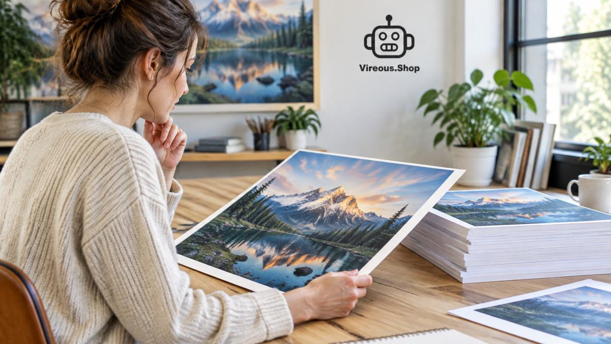 Creator reviewing a high-quality landscape art print on a laptop next to a stack of canvas proofs
-
Use PNG or TIFF. Both are lossless. Avoid JPEG at high compression, which leaves blocky artifacts.
-
Match the exact print dimensions. Crop or extend the canvas to the ratio you ordered.
-
Add bleed if the product needs it. Gallery-wrapped canvases may need extra image beyond the visible edge so the sides look full.
-
Name the file clearly with the size and product, such as
ocean-wave-24x36.png.
Before uploading, open the file at full size and look at it once more. A quick check here catches most errors.
Ordering Your Print and Checking It Before It Ships
Upload your file to the product page and review the preview. Confirm the crop, orientation, and size.
When the order ships, check the item on arrival. Look at color in natural light, check sharpness near the corners, and confirm the wrap and hardware are sound.
For fast turnaround, pick a product and printing method that matches your deadline. Our guide on choosing the right printing method for rush orders explains which options suit tight schedules.
Frequently Asked Questions
How do I make AI images high resolution for printing?
Start with the largest native file your AI tool produces, then upscale it with a dedicated upscaler to reach the pixel dimensions your print size requires. For a 16 x 20 inch print at 300 DPI, the file needs roughly 4800 x 6000 pixels. If the source is much smaller, upscale in one or two steps rather than a single large jump, and compare the result at 100 percent zoom before you order. Avoid over-sharpening, which creates halos that look worse on canvas than on screen.
What resolution should an AI image have for printing?
A common target for photo-quality prints is 300 DPI at the final print size. Multiply the width and height in inches by 300 to get the required pixel dimensions. A 24 x 36 inch poster therefore needs about 7200 x 10800 pixels for full sharpness at close viewing distance. Large wall prints viewed from several feet away can often look acceptable at lower effective DPI, so check the image at its actual viewing distance rather than relying on the number alone.
Should I use RGB or CMYK for printing AI art?
Keep working files in RGB while you edit, because it preserves the full color range of most AI outputs. Convert to the printer's specified profile only at export, and ask your print provider which ICC profile they use. Many online print services accept sRGB files directly and handle conversion internally, so a CMYK conversion you do yourself may not improve results and can shift colors. When in doubt, submit the RGB file that matches the provider's guidelines.
How can I check whether an AI image is large enough for a poster?
Divide the pixel width of the file by your target print width in inches. If the result is 150 or higher, the image will generally print sharply at poster distance. Results between 100 and 150 can work for larger posters viewed from further away. Below 100, expect visible softness or pixelation. You can also order a small test print of a cropped section to see how fine detail holds up before committing to the full size.